- 3 Little Buckets
It seems there is an endless supply of things that come in threes. The number holds some magic that just plain works. On the web designers often find manifestations of threes on home pages. Three steps to do something, three key selling points, three main products, three main options. Users love threes. McNeil believe it is because it is an easy to consume amount of information. Three options isn't so bad. Put 10 options on the page (of equal weight) and users become lost.
Many of them are action items, and quiet frequently they contain a button to inspire the user to do something. Consider the fact that these sets of buckets present themselves as a single visual entity. The user then scans through it. The point is that it is a massive visual draw and is the perfect spot to put a call to action. What does the designer wants his or her users to do? Sign up for an eval? Request more information? Register with the site? What ever it is this is a perfect spot to encourage it.
Why it is so appealing. For one it creates a perfect balance. One item split in the middle and one on each side. Four is balanced as well, but not quiet as perfectly. The other big plus is that three items is not too much to consume. One can easily scan it, four is a stretch and any more becomes cumbersome. Three is indeed the magical number. One other nice feature is that they act as a single unit and carry a lot of visual weight; through in some design elements that reinforce this and designer has the perfect spot to put calls to action.
Examples:
http://business-paper.dk/ - this website design has clearly demonstrated the '3 little buckets' concept.
http://www.attitudedesign.co.uk/ - this website is another good example that demonstrated the '3 little buckets' concept.
- One Page Sites
The one page web site is in someway's the epitome of efficient communications. It lumps all of the content in one nice list. This clearly will not work for everyone, but for many situations it is a great idea. Portfolio sites are a perfect example of this.
On a portfolio site the real goal is to grab the attention of someone who is potentially going to be paying the designer to do work. It seems there are two key elements to make this happen:
One, present the portfolio in the nicest way possible. This is especially important for those in the business of making things that look good. Designer clearly has to do his or her best to make it stand out visually while showing his or her work in the best possible light.
Secondly, enable viewer to see the work as easily as possible. McNeil thinks the one page portfolio does this in the best way possible. A nice long flow of the stuff designer has done. It isn't as easy to overlook any of the great pieces since viewer doesn't have to visit 20 pages to really see everything. Not to mention the fact that a large page of stuff looks impressive.
In non portfolio situations the single page site can still make sense. Depending on the needs it is just a matter of not over complicating things that don't need to be.
It is so fun to see what designers have done with a single page. There is no need for hundreds of complex pages to manage. A single page will do. In fact, ease of use is by far the best aspect of this style of site.
Example:
http://www.cubancouncil.com/fieldguides - this is a good example of a 'one page website'.
- Tabs
Tabs are fundamental to web design, and most large sites incorporate them. Even if they don't look exactly like tabs, they have the same function. The pattern of making them looks like tabs obviously stems from the idea of a file cabinet organized by folders. Considering this it is obvious to see why many designers have chosen to use tabs in their design. It simply helps users understand that they are getting into an area of data, not necessarily a specific page yet, but a pool of data they want to be in.
a) Traditional Tabs
Generally as McNeil explained, traditional tabs means tabs with the typical rounded top corners which also in some ways feel like a more literal or physical tab.
http://www.kits4rbaby.com.br/ - this website has a 'traditional tab' at the top left of the page.
b) Stylized Tabs
These tabs are extremely gorgeous and help create a polished look, this attention to detail has really pushed these sites.
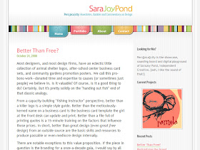
Sarajoypond.com is a terrific example. The tabs maintain the concept of major navigational sections, and carry the visual weight needed to establish a primary navigation element. This combined with some elegant stylization unifies the design of the site.


No comments:
Post a Comment